click on images to view larger
Tuesday, May 31, 2016
Monday, October 20, 2014
The Artist's Signature - To sign or not to sign? **ART RANT**
Signing/autographing pieces; yay or nay? No doubt this is an old debate stretching back as far as who knows and by no means intend to offend anyone who does practice this convention. I for the most part, do not, in the traditional sense, sign anything I create. At the very least, I may sport a monogram or somewhere obscurely, write in very minute lettering my last name and date (I do however add the necessary artist information on the back of a piece for archival purposes).
Perhaps it's an artistic decision to preserve the true aesthetic nature of a piece and not mar it with the conceit of a signature. Or perhaps an act of humility, separating the art from the artist to allow the art to speak for itself? Or conversely, an act of arrogance, to note that only those worthy enough will get the blessing of an autograph?
Of course wilh all artistic decisions, it always comes down to the artist and at no point do I have the authority to take that choice away from any fellow artists. But at some point do signatures stop being a simple acknowledgement of pride to one's work, and become a paranoid, self-indulgent scramble to preserve ownership of everything created from little napkin sketches to ambitious finished pieces?
I digress here slightly, and while this somewhat differs from a signature, I present the habit I see used in a lot of contemporary photography as my point of criticism; the vehement practice of branding photographs with everything from an artist's logo, name, to email addresses. I can understand this use with the intention for portfolio or clientele purposes, but my gut reaction remains the same. I may be alone on this, but everytime I see a photographer's name or logo on a piece, I immediately stop looking at the object, person, or scene depicted and lock my attention to the branding. Instead of enjoying the craft and artistry of the composition, or imagining the context in which it took the photographer to get the shot, and more importantly "do I hire this photographer for their skills?", here I am thinking about the logo, the placement, the font used; everything but the photo itself...
For better-or-worse, I particularly lean on the side of not signing my pieces. By-no-means am I vigilant in this practice and sure I've been a hypocrite to my very opinion. In my criticism to the opposite, it is completely and merely that; my opinion. I bode no personal insult, harm, or condemn anyone for their artistic decisions.
In all fairness, I am curious to what motivates other artists to sign their pieces and to what degree? Do you do a full signature or employ a monogram of sorts? Do you cleverly hide it or present it proudly as much a part of the piece as the piece itself? I call to even non-artists; as participants in the audience, do you prefer seeing one practice over the other or does it even cross your mind?
Weigh in if you may, or not; you can just as well chalk up my rant as the meanderings of a pretentious artist with too many thoughts floating in their head :P Either way I would love to hear thoughts from either side . Enjoy!!
**END RANT**
Wednesday, October 15, 2014
left HANDED draw - alexpascualart - INKTOBER 2014 - PLUS: Old Art School Memories I
In reaction to my recent art rant (see below), I decided to attempt a drawing using my left, non-dominant hand. I know what to expect physically and creatively from my right-hand. Perhaps by taking advantage of the virtual inexperience my left-hand has, I can tap into that Buddhist idea of "the beginner's mind". And for a brief moment escape the trappings of my experience. please watch and I hope you enjoy!! :)
left HANDED draw - alexpascualart - INKTOBER 2014
**random art rant**
Something reminded me today of an old classmate I had in the open art studio at The Evergreen State College. She was an older lady, guessing returning to school, and had little to no proper art training, or quote-on-quote, natural-talent. In a class full of young, talented, avant-garde, art scenesters (i.e. the proto-hipster) you would think she didn't stand a chance.
But I remember really liking her stuff for its raw nature; its lack of finesse; the complete utter disregard for any technical prowess. What her pieces did have was an honest and unpretentious quality and an unintentional degree of darkness that the other students could only wish to purposely create. Sometimes, for all the skills I've collected over the years, I wish, and even attempt at times, to paint or draw with that same artistic naiveté; too perhaps capture something more visceral and primal than merely honing my craft with some proof-of-concept in hope to impress.
Pablo Picasso could render and sketch like a master before any of us could even learn to drive, but decided later in life to go the way he did. An old art-school saying, "learn the rules so you can break them" comes to mind. Although I do identify with my own style and clearly see my influences within my work, the artistic arsenal in witch I enact my works are the exact trappings that occasionally haunt me in trying to continue and discover new ways to express myself.
So to you my old classmate, forgive me for I cannot remember your name, but cheers to the talentless, the headstrong, and those who want to break the mold, both inner and outer. For their sakes, maybe we can find sanity together.
**end rant**
Thursday, August 14, 2014
PROCESS PIC GALLERY: Custom Articulated Plant/Baby Groot 1:1 figure - artist: Alex Pascual
Here is the PROCESS PIC GALLERY: Custom Articulated Plant/Baby Groot 1:1 figure
Interested in my process? Please enjoy the pictures and visit www.alexpascualart.com:)
See finished figure here
Initial head sculpt; using Super Sculpey, wire supports for "hair"
ball joint taken from pre-existing action figure (2007 TMNT)
shaving, re-attaching, & cutting parts for articulation and skeletion
wire supports for fingers
base sculpt
filling body
full body sculpt
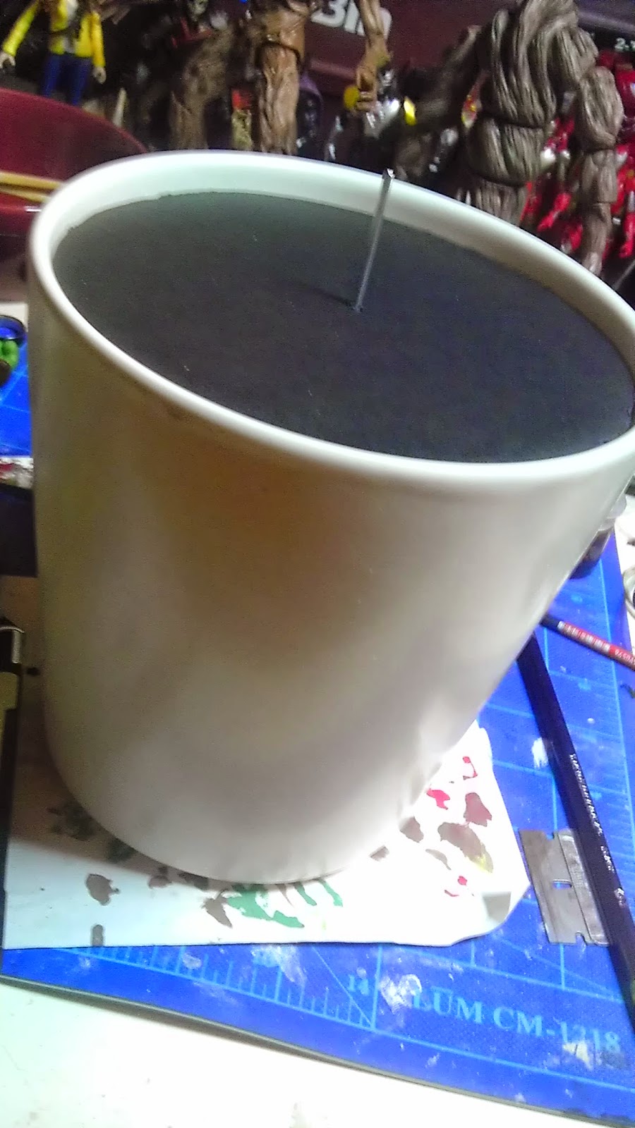
found ceramic pot
base color
dry brush and color wash
highlights
painted head
green "moss/greenery" highlighs
pot structure; wood, foam board, & steel wire
foam filler
test holder peg
"soil" sculpted out of plaster of paris and sand
"soil" painted
pot spray painted metallic grey
test fit
Subscribe to:
Comments (Atom)


